Ringkasan Proyek: Completed as a Project-Based Internship with FundEx (facilitated by Rakamin Academy), this project focused on revamping the user interface of an Equity Crowdfunding platform. The goal was to transform a complex financial platform into an accessible, trustworthy digital environment for both investors and business owners.
The Challenge (Problem): Financial platforms often suffer from information overload. The existing interface presented a high cognitive load for first-time investors, making it difficult to understand the value proposition. The lack of clear visual hierarchy also reduced the platform's perceived credibility a critical factor in the Fintech sector.
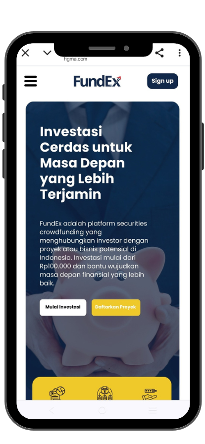
The Solution (Design Strategy): I approached the redesign with a Trust-First methodology:
- Visual Hierarchy: Restructured the layout to prioritize key information (Project Funding Status, ROI, and Risks), guiding the user's eye naturally.
- Conversion Optimization: Redesigned the Call-to-Action (CTA) buttons to be prominent and context-aware, reducing friction in the investment flow.
- Accessibility: Improved contrast and typography to ensure the platform is readable and inclusive for a wider demographic.
Hasil Akhir: A modernized, professional interface that communicates authority and security. The new design streamlines the user journey from "Discovering a Project" to "Making an Investment," significantly improving potential conversion rates.
🧩 Bidang Topik
🛠️ Keahlian yang Digunakan
⭐ Key Improvements
Clearer Navigation: Streamlined structure helps users understand what FundEx offers, faster.
Stronger CTA Placement: Key actions like “Invest Now” and “Start a Project” are more visible and better positioned.
Visual Hierarchy: Improved layout, spacing, and typography guide user attention effectively.
Modernized Look & Feel: A cleaner, fresher interface that better communicates credibility and professionalism.